Data Visualization
Communicate Through Visuals
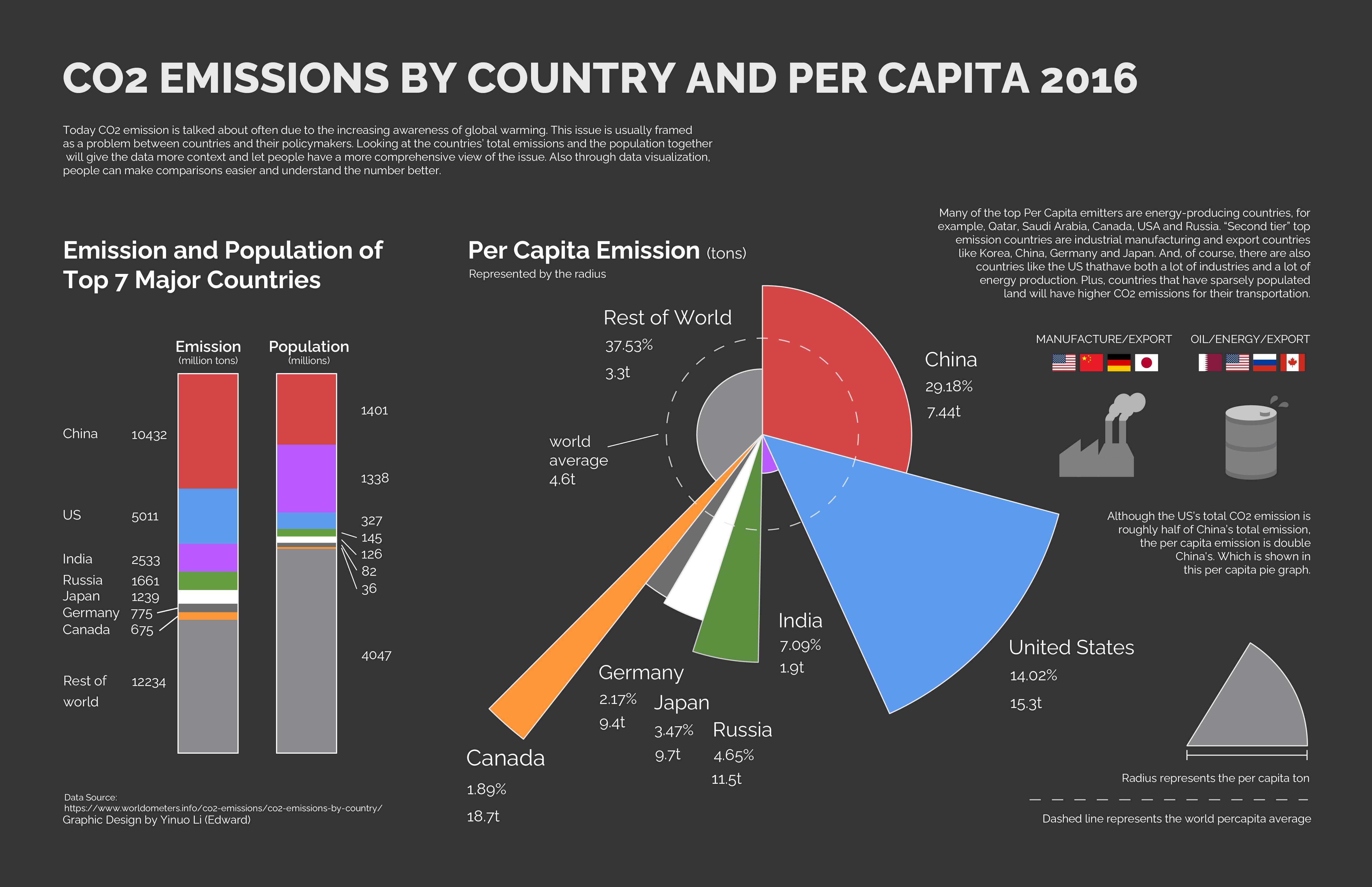
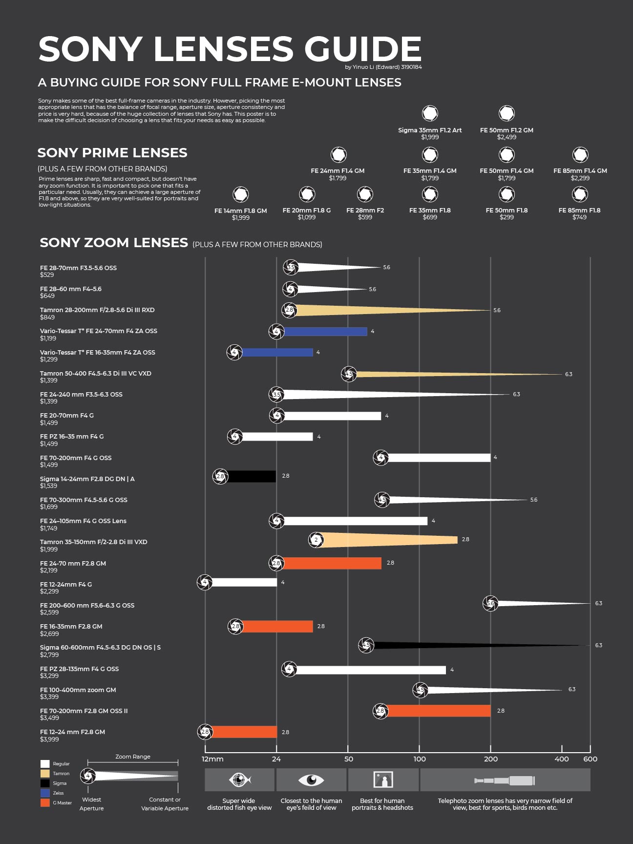
This project explores how data can be communicated through visual design rather than text alone. By combining charts, composition, and typography, I aimed to make information easier to read while also creating a strong visual impact.One piece focuses on presenting environmental data through a graph-based layout, using contrast and structure to make patterns more immediate and understandable. Another piece applies data visualization in a poster format, combining statistics, image-making, and typography to create a more expressive and engaging way of reading information.
Liquid Glass — US Economic Dashboard
A glassmorphic data visualization dashboard inspired by Apple's design language. Built with Next.js, React, Recharts, and Tailwind CSS, the project transforms real Federal Reserve (FRED) economic data into an interactive, visually engaging dashboard.
The dashboard tracks key US macroeconomic indicators — GDP, unemployment, CPI inflation, the Federal Funds Rate, and the Debt-to-GDP ratio — with historical context from 1960 to 2026, including shaded recession periods on time-series charts.
Key design decisions include a custom glassmorphic surface system with backdrop-filter blur, gradient-filled chart areas, and a fully responsive 12-column grid layout. The project supports both dark and light themes, as well as dual-language switching (English and Chinese).
Data sources include the Federal Reserve Economic Data (FRED), Bureau of Labor Statistics (BLS), and Bureau of Economic Analysis (BEA).
Conclusion
Through this project, I explored how data visualization can function as both an analytical tool and a design system — helping viewers quickly understand information while maintaining clarity, rhythm, and visual interest.
See my work
Here are a few of my other projects. Feel free to explore.